Wednesday 21 April 2010

Question 7

Looking back at my preliminary task, what do I feel I have learnt in the progression from it to the full product?

I think I learnt a lot about using the SLR camera and if i hadn't had the experience of using it for the preliminary my photos in the finished piece would be nothing like they are.
I also learnt that organising my time was very important as if I left things then I would have to rush them to meet dead lines and they were not as good as I could have done them so I tried to make sure I kept on target and did not have to rush pieces of my magazine.
Preparation and planning also need to be done thoroughly, I learnt this in the preliminary as if it's not done properly you get a bit stuck, so then made sure for my final piece it was done sufficiently.
I felt confident with Photoshop in the preliminary but found Quark express much more complicated and harder to use. Although by the end of the final piece I had become much more confident with using the tools within the software.
The biggest thing I have learnt from this project is not to rush in with all your ideas thinking that it will tern out amazing if you just 'throw them all together' but to take the time to plan it out and find the best way to put all those ideas together to form the best presentation you can achieve.

Question 4 and 5 Evaluation

Who would be the audience for my media product and how did I attract / address my audience ?

Teenage to early twenty males, from a better off working class or lower middle class background would be the perfect demographic profile of a buyer of this magazine. Also in terms of a 
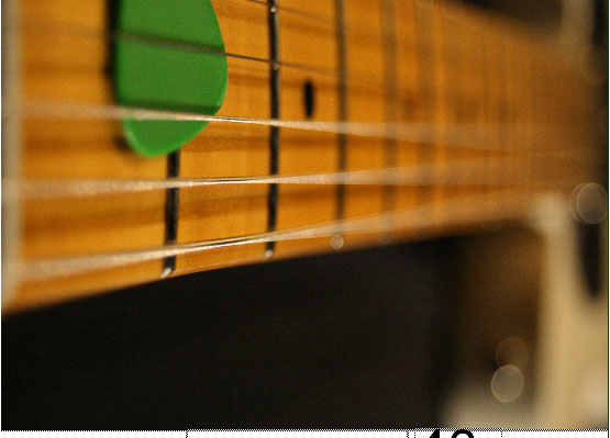
psychographic profile would be an attitude of rebellion, where they just want to do their own thing, with interests in guitar and rock music. With a 'rock and roll', hedonistic life style, this means they would not be to bothered with their work or other responsibilities, but only the things they enjoy and want to do. A perfect example shown in the photo.


I asked my friends what they thought of my magazine cover asking this question.
What did you think to the presentation of my magazine including fonts and colours ?

8:29pmJames
I like the font, could be a little more bold though. The colour is good but would prefer a more vintage style to go with the theme of retro looking guitar

This is good criticism as it brings up issues as to whether I have laid my cover out in the right way, and if I should have chose a slightly different font.

8:29pmScott
i think the fonts and colours are very eye catching for the young audience, they stand out well. because my attention is caught i want to read on because it is easily lay out.

8:33pmRyan
i thought that it was good. i Also thought that it suited your target audience well.

8:33pmSam
the fonts were good and worked well together creating a young look to the magazine and i liked the colours as i thought they worked well together.

But the fact that sam thought the fonts look good show there is a difference of opinion within my target audience.

The feedback i received from my magazines audience suggests that i did my audience research well and that the fonts and colours used were the right ones for my magazine as all the people I asked either like rock music or play guitar and so would be interested in buying this magazine. They reacted positively to the magazine and some said it is lacking in the market and should be done for real.

I followed a number of conventions which guitar magazines similar to mine all use. For instance having a range of the different articles on the cover, on my covers beneath strap lines i have photos of what the article is on for instance a guitar pedal and a photograph of a person that will be in an interview.

Monday 12 April 2010

Question 2 Evaluation

How does you media product represent particular social groups ?


My magazine dominantly represents males and females are absent from it, not because females don't play guitar but because men are the stereotypical group when representing a magazine such as mine, they are the dominant representation which I chose to stick with instead of portraying emergent or an alternative representation. This photo demonstrates the dominant representation of my magazine.


Its also aimed at teenage to early twenties age bracket, in terms of socio-economic class the magazine is aimed at the lower middle class as the magazine looks at expensive equipment. Another group this magazine is aimed at is 'computer geek/technical types' not because of the style of the magazine but because of the content as there are articles on effects used etc.


In terms of communicating the magazines values to the reader, the language used is very important as it is casual and 'everyday', very informal. Also the use of photos, for instance the main photo on the contents page shows a guitar neck focusing on the plactrum. However the stings are vibrating but also slightly blurred, so the photos are stylish but at the same time have some edge to them.


Question 1 Evaluation


My media product uses existing conventions in terms of its layout for instance my front cover denotes a close up photo of the main sell which is Fender verses Gibson so shows an image of there two guitars.

This is a conventional practice as on all magazine covers the Main sell will be the background of the cover. But many magazines in the genre are aimed at adults with little focusing on adolescents. For instance the Guitarist magazined shown here it uses neutral colours that do not appeal much to youth and could connote such things as blandness, dullness and just a bit boring for a teenager and it isn't grabbing their attention.
Although there are parts of their magazines aimed at beginners that does not essentially mean teenagers. I have aimed my magazine at teenagers as although it is similar to other magazines it challenges the traditional conventions by changing who it is aimed at slightly. For instance Guitarist uses Serif fonts which are mainly used for older and more sophisticated audiences, where as I have used sans serif because I am aiming mine at a younger audience.This makes it stand out as different, as my cover connotes rebellion, power and chaos.
The text in the Guitarist magazine cover is in order and all to one side, where as my cover is spread out and chaotic this also connotes youth like characteristics as they tend not to be organised, and like a lot going on, so this is something they can relate to.